Friday, 18 December 2009
Christmas
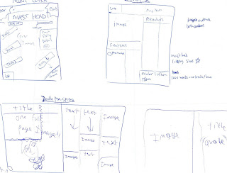
I have completed my front cover i am content with the way it turned out. I have a plan for my contents page that i think will work very well. But i'm putting it off till after Christmas, so i can enjoy time with my loved ones. Merry Christmass every one :)
Thursday, 17 December 2009
Friday, 11 December 2009
Monday, 7 December 2009
Target audience
Audience
Gender: both mainly male.
Age: 14-30.
Interests: Rock/gameing.
Lifestyle: standard-not too expensive.
Ethnicity: N/A.
Physical ability: reading ability average.
Monthly mag- £2.50
Gender: both mainly male.
Age: 14-30.
Interests: Rock/gameing.
Lifestyle: standard-not too expensive.
Ethnicity: N/A.
Physical ability: reading ability average.
Monthly mag- £2.50
Friday, 4 December 2009
identifiying my target audience
I am still looking for a target audience, untill i can find a target audience production of my magazine will be postphoned. Another altenative would be to make my magazine any way and deconstruct it, that could help me identify my target audience.
Tuesday, 24 November 2009
Textual Analaysis 3 :P double page spread.
Uncut magazine has a double page article on Bob Dylan, featuring a black and white image of the artist himself, shot in a medium close up. It's probably shot in this fashion to create a sense of nostalgia. on the other page lies a long title printed in large white font against a red background. Under the title is smaller white font detailing the article. under that text is a retangluar box with even smaller black text against a very light brown background laidout like a news paper clipping.
Mojo magazine has a double page article on Bobby Gillespie, featuring a colour image of the artist, with female performers in the background. the image is done with a midshot. The costumes the preformers have on are designed to make them look partly naked, to appeal to a male audience. The artcle features a short title printed with large red font against a white background.
The Word has a page spread article on John Msrtyn, featuring a colour image of the artist shot with light shineing on his face. the medium close up and lighting are used to show his emotion.
Monday, 23 November 2009
Textual Analysis 2 contents page.
Mojo has a double page spread for its contents page, with text and page numbers on the left page and related images on the right. while The Word and Uncut have their contents on a single page, and a large advert on the other page.
Mojo and The Word have their page numbers in numerical order, while Uncut has its content and page numbers split into three catagories features, regulars and reviews. Mojo has its page numbers both next to its articles and next to/on its images.
Uncut's contents page is laid out like newspaper article, with a main image and text under it arranged into columms.
Uncut and The Word have a similarity in the contents page that being they have coverstory/on the cover written next to the articles that are on the cover.
The font of any good music magazine has to be clear and readable, the usual style used is a medium black font. Mojo and The Word use clear black font for their texts and articles in their contents page. Uncut has a brownish yellow for its articles but black text under them.
The word has large readible text compared to Uncut, Mojos text is prehapes a little larger than The Words text and larger than Uncuts text. Uncuts text is small and may be harder to read.
Subscribe to:
Posts (Atom)


